It’s been a while since a trip out so it was a welcome break on a Sunday to have a jaunt into London to see the The Art of the Brick exhibition with Heather’s family. Nathan Sawaya has brought Lego building into the art world, creating sculptural pieces out of the famous plastic bricks, with varying degrees of success. He’s hungry for coins
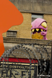
Purple Dinosaur
We met up outside the The Old Truman Brewery, once we’d found which of the tight streets and lanes to go down. While waiting for the late comers Heather and I had some time to grab some lunch from the street vendors forming a little square of food retail nearby, overlooked by a purple dinosaur and other quirky art.
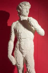
David
There’s no brick based penis though
Once inside the exhibition opens with large scale “reproductions” of classical statues: Michelangelo’s David (no Lego penis though), the Venus de Milo, Rodin’s The Thinker. The initial impression is one of being impressed someone has gone to the effort of working out how to make a reasonable likeness in Lego but also a sense of a need for originality. Large scale reproductions in Lego aren’t new (there’s even Lego’s own architecture series of famous buildings, for instance) and once you’ve seen one Lego statue there is a sense of having seen them all. (The niggling sense of originality is one that pervades the works—if one ignores the medium is there anything being said that isn’t an echo?)
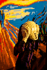
Screaming Out
An interesting build out of the famous Scream
Hanging above the sculptures is a Lego stud pixelated extract from the Sistene Chapel ceiling. This is a precursor of things to come, the next section being filled with stud recreations of well known paintings. It’s nice to see it can be done but no more impressive (and at times of a lot lower resolution) than those images made out of smaller images or other pixel apparent works. The only piece here which really works is a copy of Scream where the screaming character builds out from the background in 3D horror. That’s symptomatic of most of the exhibition; at its best when the artist allows the medium to work in interesting ways, or at least says something original with it, rather than just building an apple.
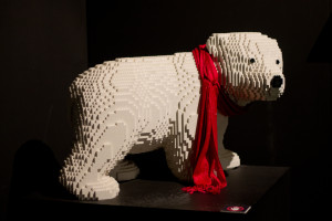
Polar Bear
It’s cute but is it Hamleys or art?
To be honest the first couple of rooms do feel like something of a lead up to the main event, an opportunity to show that the artist is quite capable of producing such things before getting into the more interesting pieces. Even there though, alongside “meaningful” pieces such as a giant pencil writing “yes” there are reproductions of mundane objects such as scaled up chess pieces. An interesting skill in itself but if one takes away the fancy spotlighting is the cute baby polar bear in the corner worthy of an art gallery any more than a display from Hamleys?
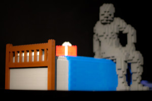
The Box
I like the mystery of the scene
Perhaps the ordering of the pieces is more deliberate though, a progression of expression. Things do get better. A hand reaching through a computer monitor may be passée but at least is a statement of some kind (the exhibition booklet notes reveal that the hand was added two years after the original computer model was completed, so is this the artist “maturing”?). There’s an at least intriguing small scale piece, The Box which holds promise but then one finds a grouping of almost educational pieces. A globe, the planets (including Pluto) stacked together over the Sun, a smiling Sun with a (printed) display of the solar system. It is back to clever building but no real statement.
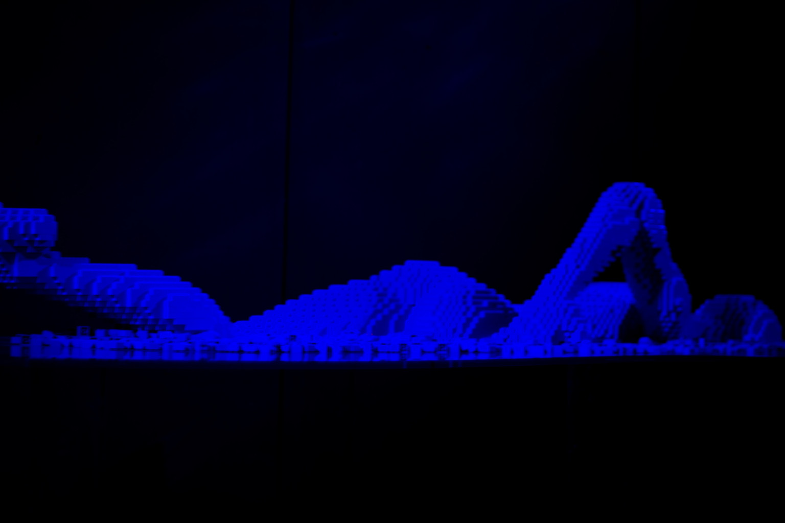
Swimmer
The lose bricks make the water which the figure breaks through
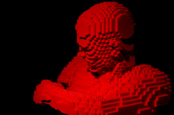
Torso
Does one Lego head look like any other?
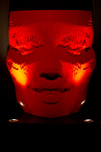
Red Head
Not of the hair colour kind!
It may be that I am being somewhat unfair. After all, the original David is just a very well executed sculpture that happens to be out of marble rather than Lego. Yet there is the feeling of something missing. Perhaps it is the modernity of the plastic bricks but one expects a contemporary commentary, an informed thinking, that oft is lacking. Yet there are pieces here which stand up to scrutiny, would even feel at home in an exhibition that wasn’t all Lego (and is that the test I’ve been trying to articulate?) The Swimmer, with an eerie blue glow, is a fine work. One wonders what is hidden beneath the blue brick “water”, who the swimmer is (are they male, female?), and there is a motion, a sense of muscle which hints that they are swimming to or from something. It is the start of the art proper I suppose. A small man climbs a ladder growing and looping down from his own upreaching arms; A torso builds, or tears apart, an arm. This, as I mentioned earlier, is the medium working for the artist. Less successful are the large face reliefs, each a different colour, hovering on one wall, and the similar skulls which come later feel like nothing but a variation on the theme.
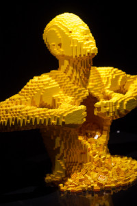
Tearing
Yellow speaks of tearing from our hearts
The collection is hit and miss like that. The exhibition’s most recognisable piece, carrying its advertising, is Yellow, Lego brick guts spewing from a torso who’s arms rip itself open. It’s an effective (if not overwhelmingly original) piece. Yet the nearby Pencil Head feels far too predictable. Three torsos with geometric heads are interesting but perhaps don’t say quite what the artist thinks they do. Then Hands, a destitute kneeling figures staring at its own dismantled hands, is much more effective.

Black Block Demon
The shadow from one of the pieces causes it’s own art
As well as those pieces where the medium is working there are a couple which work all the better because the Lego almost vanishes. An untitled piece is lit and built in such a way that the curving bricks blend away, strange pinpricks of light breaking through, as a small figure pushes against the circular wall it has trailed behind itself. Or a hanging, contorted torso unintentionally gives a shadow which attracts more than the piece itself.
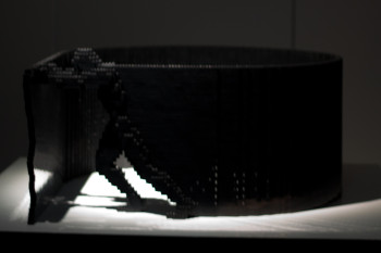
Push Oneself
The walls we build are our own

Tree
The Lego tree appears surreanly in the photo beside it
There are a large number of those torsos, admittedly in various poses but at times one wishes the artist would just do something which doesn’t involve one. The final room, a new additional for the exhibit’s extended run, draws him out to do so in more meaningful way than a full scale call box or model of the Beatles. A collaboration with photographer Dean West [warning; typical photographer stupidly flash heavy site]. Photographs containing Sawaya’s work, displayed here alongside the Lego piece itself, form an interesting tension between reality, manipulation and the simplistic world of the brick.
The simplistic world of the brick seems at times a good description of the exhibition, actually. There is something here but it could do with trimming. The best works picked out, a lot of the tiger-giraffes sent to the toy stores.
Impressive and at times interesting but needs to be brought down to minifig scale.
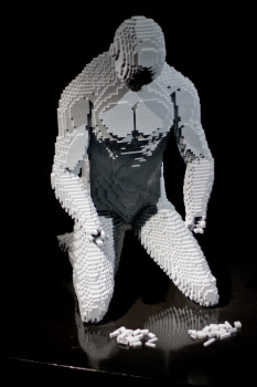
Hands
Waiting for someone to perform reconstructive surgery

Bricks and Shadows
The landscapes of Lego, light, and shadow
Comments and Pings