saw a little trip out for Heather and I, taking in an exhibition right up our street, and after lunch excitement was delivered by a ride on a little train! Here I’ll talk about the maps.
Magnificent Maps Of London
First stop of the day was the slightly obscure London Metropolitan Archives, hidden away round the side streets of Farringdon. It’s not exactly an exhibition space, but they do have a room and a staircase even if you do have to sign in at the front desk like it’s a work meeting at an office. We were there for Magnificent Maps Of London, a display of a collection of maps from the archives.
There is something about maps that appeals to the investigating scientist in me. The game of what was here? What can this abstract representation of the world around us reveal? And London must be one of the most mapped cities in the world, from before cartography was even a thing, which gives quite the range to choose from. Thus it was a diverse collection that awaited us (a bigger display than we’d anticipated), beginning on the staircase. To be honest, the stairs aren’t exactly the greatest place for such a display, being quite crowded and a bit difficult to stand and look at the details. Be that as it may, we were too enthralled for those minor quibbles to distract us.

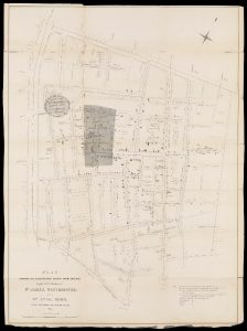
Plan showing the ascertained deaths from cholera in the parishes of St James, Westminster and St Anne, Soho during the summer and autumn of 1854
London Metropolitan Archives. This version downloaded from The Wellcome Collection
Selected details of some of the larger, city wide maps were here, as an appetiser for later. Interspersed with them were some of the more varied uses of mapping. There was professional interest in the 1892 Water Supply Map Of the County Of London I get the need for a watermark, but the ones on the London Picture Archive is annoyingly large and often in the way when it comes to something like maps., showing something that would probably now just say Thames Water. Other eye catching maps on the way up the stairs included reminders of how much disease was able to run rampant within the growing city, with Soho cholera deaths (a later version of Snow’s famous map—note the pump on Broad Street) and a city wide map showing cases of Entric Fever (typhoid).
Of course there’s always been pressure for ways to get around London. So we saw typical 1960s plans for a network of “Urban Motorways” (which never built end up looking like the north/south circulars), and an early tube map. Perhaps it would be better to just walk, though I’m not sure how much use the Pedestrian’s Companion would have been!
Finally reaching the top of the stairs, the main room was quite a bit bigger than we were expecting—the “Mediatheque” alongside promised the chance of yet more maps to be pulled out the archives, but that might have been overkill. The walls were covered in various maps, with a couple of glass cases holding smaller examples.

Horwood's Map Of London
London Picture Archive. This version screenshotted from the zoomable version at The Grub Street Project
Quite a few of the usual suspects were here. Booth’s Poverty Map is so well know it has a dedicated website which includes digital scans of the notebooks used to produce and update it. And the bomb damage maps are possibly best viewed as part of the excellent Layers of London site, which allows zooming into the individual coloured buildings, all looking quite jolly until one remembers what the colours represent. There’s an obvious synergy between that and Leake’s map of damage caused by the Great Fire.

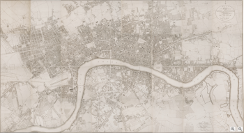
Map Of London From An Actual Survey Made In The Years 1824, 1825 & 1826
London Metropolitan Archives This version from Harvard Library
Early mapping was represented by Civitas Londinum from 1633—perhaps most infamous for showing the bear and bull baiting debauchery of the south bank, or the bit later 1799 map of Horwood. Ogilby’s detailed Map of the City Of London, fascinating in the ability to trace the still present streets, and the old wall around the city. And Greenwood’s colourful Map of London From An Actual Survey, looking very much like a modern map might.
There were maps less concerned with accurately placing every building too. Some London wide but less than precise, such as the very touristy Bastion of Liberty map, while others were more about the data overlaid on the base cartography. A view of Tower Hamlets showed the racial violence endemic in the 1970s, or perhaps an overview of the Jewish population in 1899 East London. There were even things that weren’t really maps, in the normal sense. A version of the tube map celebrating black history, or even what’s really an online project in the London Sound Survey.
There were many more, each as fascinating as the last, taking us well over the hour to look around and leaving us a bit less time for lunch, before heading to the next excitement of the day.

Comments and Pings